Improving Campaign Visibility
at Scale
Feature Redesign -- Elevating Campaign Visibility & Performance in E-commerce
Project Overview
At Contorion GmbH — a Germany-based B2B e-commerce platform for tools and industrial supplies— we faced a growing disconnect between the promotional campaigns on our site and the experience of end users. I led a cross-functional UX initiative to reimagine how onsite campaigns are designed, implemented, and measured, aligning business needs with user-centred design principles. WKZ (Werbekostenzuschuss), our supplier-funded campaign model, required particular attention as it involved multiple stakeholders and complex creative input. This case study captures the transformation of Contorion's campaign infrastructure into a scalable, data-informed, and stakeholder-friendly system.
My Role
My Responsibilities
Collaborators
UX/UI Designer
UX/UI Designer
Product Manager
Developers
CRM
Collaborated in UX strategy and execution for the campaign system redesign
Facilitated stakeholder workshops
Conducted user and internal research
Designed wireframes, high-fidelity prototypes
Tools

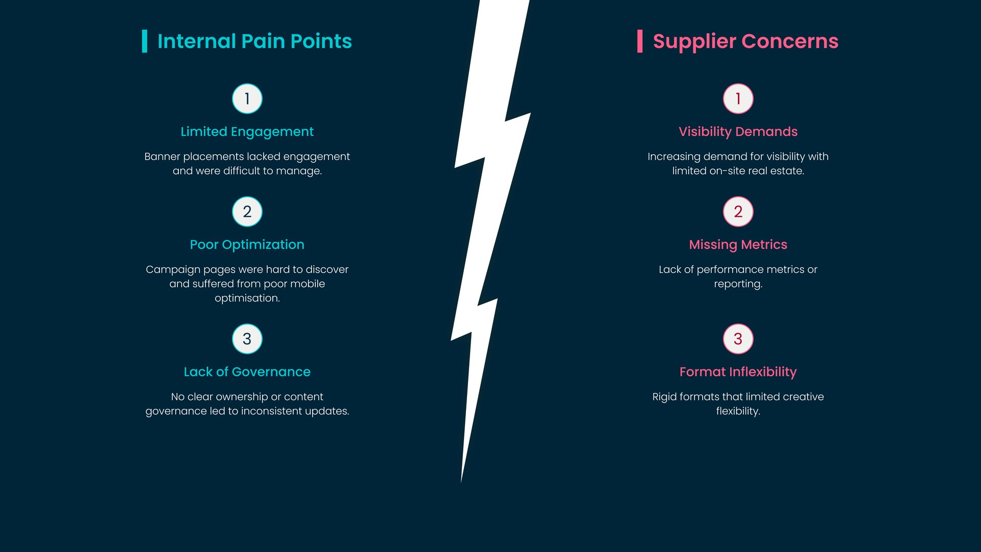
The Problem
Internal Pain Points
Banner placements lacked engagement and were difficult to manage.
Campaign pages were hard to discover and suffered from poor mobile optimisation.
No clear ownership or content governance led to inconsistent updates.
Supplier Concerns
Increasing demand for visibility with limited on-site real estate.
Lack of performance metrics or reporting.
Rigid formats that limited creative flexibility.
The Goal
Our 3 steps to reach the goal:
Deliver campaign formats aligned with user expectations and supplier goals.
Streamline internal workflows for campaign implementation and maintenance.
Introduce performance KPIs and measurable tracking to improve transparency.
Design Process
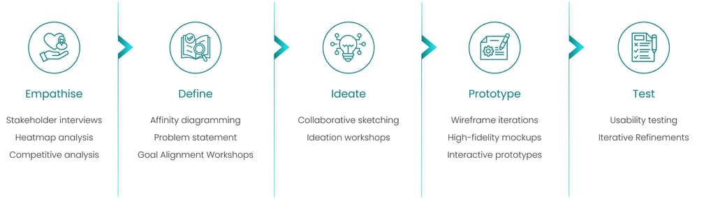
Uncovering The Disconnect
To uncover the underlying problems with the existing campaign setup, I began with immersive discovery across departments and user touchpoints. This included:
Identifying the problem via stakeholder interviews
Further research & discovery via a behavioural data analysis, and industry benchmarking.
To uncover the underlying problems with the existing campaign setup, I started by examining both internal pain points and external stakeholder concerns. This process involved immersive discovery sessions, including interviews with cross-functional teams. These efforts enabled a clear understanding of internal pain points, bottlenecks in implementation, and misalignments with supplier expectations.
Identifying the Problem
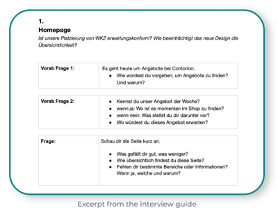
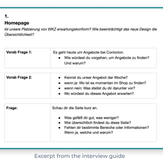
Stakeholder Interviews
We utilised our internal heatmap tool, developed by the Business Intelligence (BI) team, to identify underperforming placements. This tool uses code snippets and event triggers to track basic user interactions like clicks and hovers. The resulting data is stored in our internal database, providing us with valuable behavioural insights — although its accuracy is contingent upon users opting in to tracking.
Digging Deeper into the Challenges
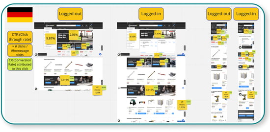
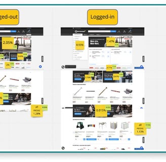
Heatmap Analysis
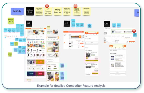
We reviewed competitor websites to benchmark UI strategies and campaign placements. Our focus was on homepage visibility, integration quality, and landing page design
To guide this analysis, we asked targeted questions such as:
Placement: How do competitors display and position their campaigns
Campaign Visibility: Where else across the shop do campaigns appear
UI Integration: Are the campaigns well integrated into the overall UI and accessible
User Journey: Where do banners lead, and what is the structure and UX of the landing pages?
Competitive Feature Analysis
Sharpening the Focus
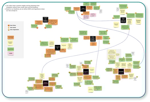
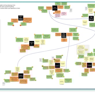
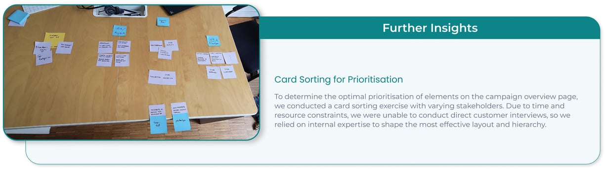
Following an extensive discovery and research phase, we transitioned into making sense of the data collected — transforming observations into actionable opportunities. Alongside my UX/UI design colleague, I facilitated a synthesis session grounded in affinity diagramming. We gathered all our insights from stakeholder interviews, heatmap analysis, and competitive benchmarking to surface common pain points and patterns.
By clustering related findings, we uncovered shared challenges and recurring themes — from fragmented visibility to inconsistent design standards — which allowed us to formulate design hypotheses and determine strategic focus areas. These insights were then presented to our product manager to explore the potential scope and validate the project's direction.
Affinity Diagram
Key Takeaways
Evolving Ideas Into Tangible Solutions
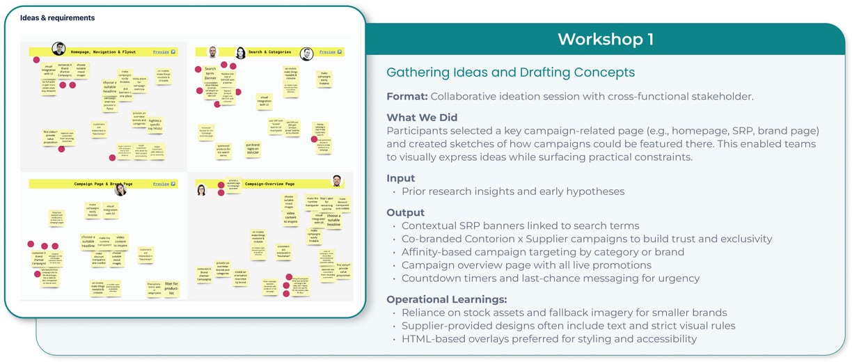
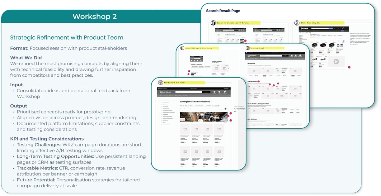
Translating Vision Into An Experience
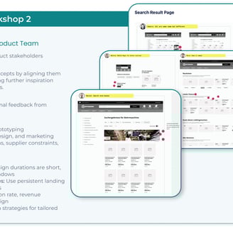
After gathering ideas and insights from our ideation workshops, we moved into the lo-fi wireframing phase. This step helped us visualise early concepts while keeping feasibility and design constraints in mind. Our wireframes were guided by clearly defined principles to ensure flexibility and accessibility across formats and devices.
Design Principles & Constraints:
Use flexible modules that accommodate multiple content types
Prioritise accessibility — even when suppliers submit image-only mockups
Ensure mobile-first layouts and scalable UI patterns
Integrate with existing personalisation and testing tools (e.g., Dynamic Yield)
We sketched several wireframes for homepage placements, brand pages, campaign detail pages, and the new campaign overview hub. These wireframes helped align design intent with business feasibility and acted as a foundational bridge into high-fidelity prototyping.
Low Fidelity Screens
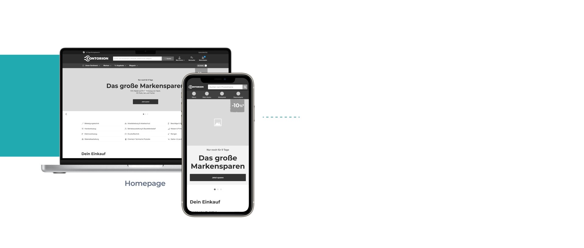
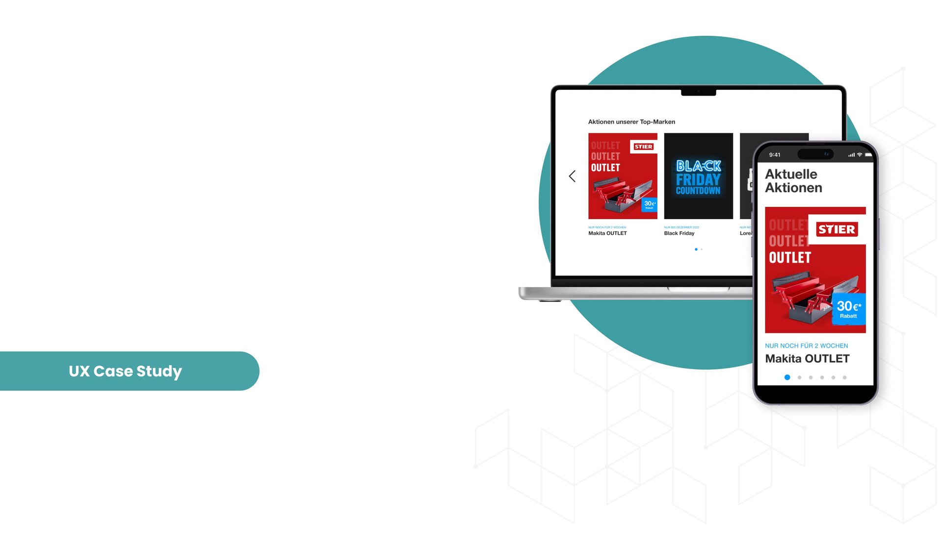
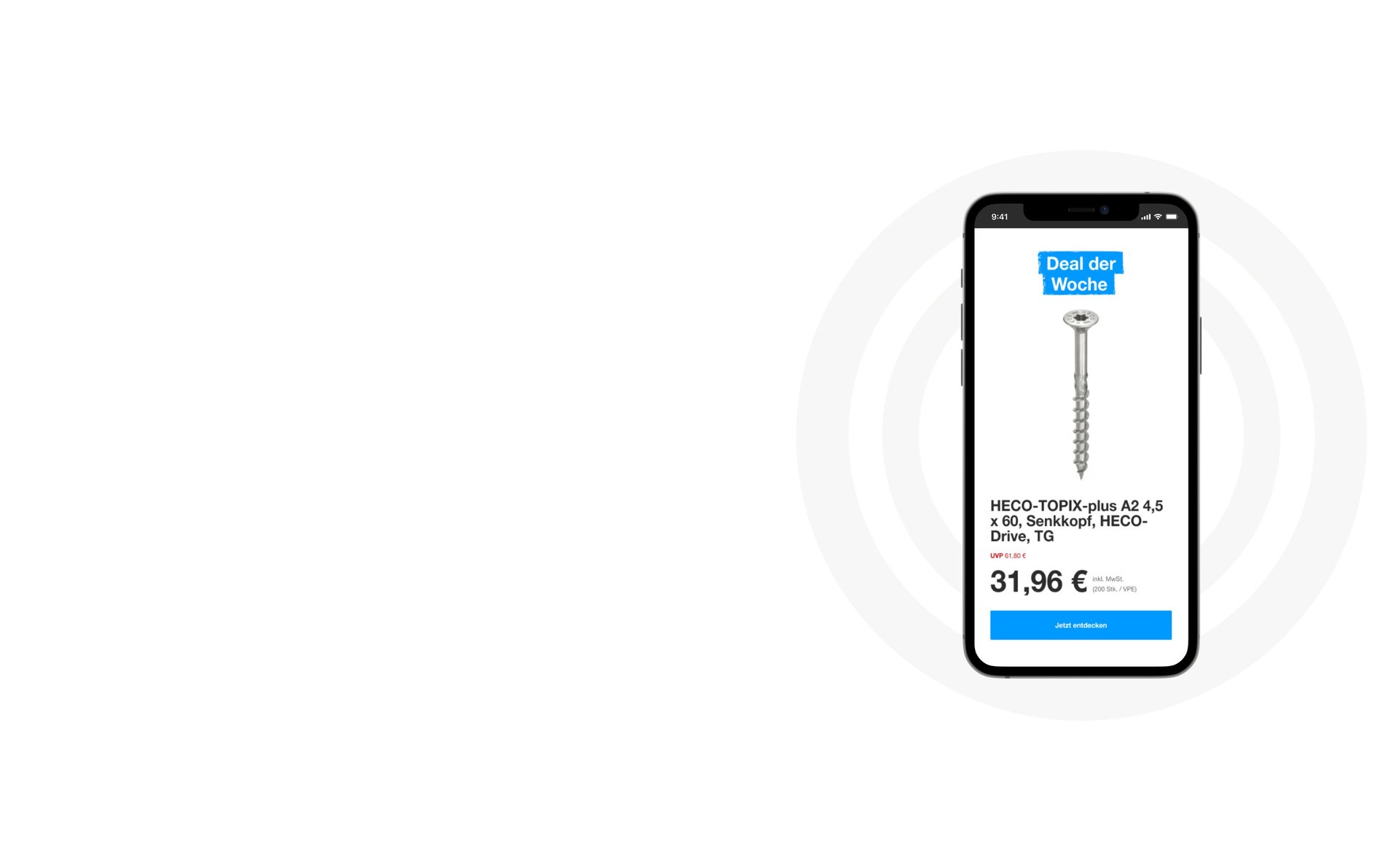
Implemented a hero banner slider to showcase multiple campaigns within the same space, replacing the previous static image. Enhanced CTAs to drive higher engagement and interaction.
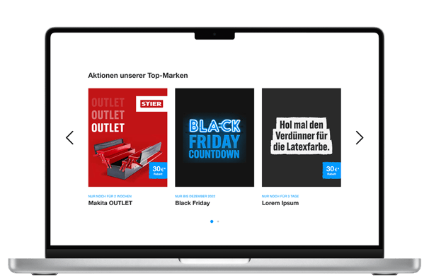
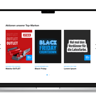
Created a concise and structured campaign overview at the top of the page for quick access.
Highlighted key campaigns with ample space to enhance visibility and provide users with clear, relevant information.
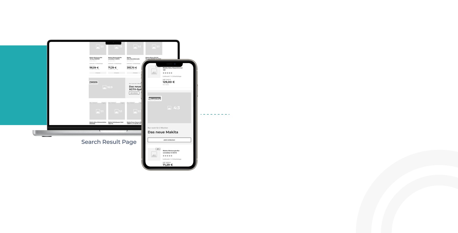
Added a required campaign block within search results to meet stakeholder demands while aligning as closely as possible with UX best practices.
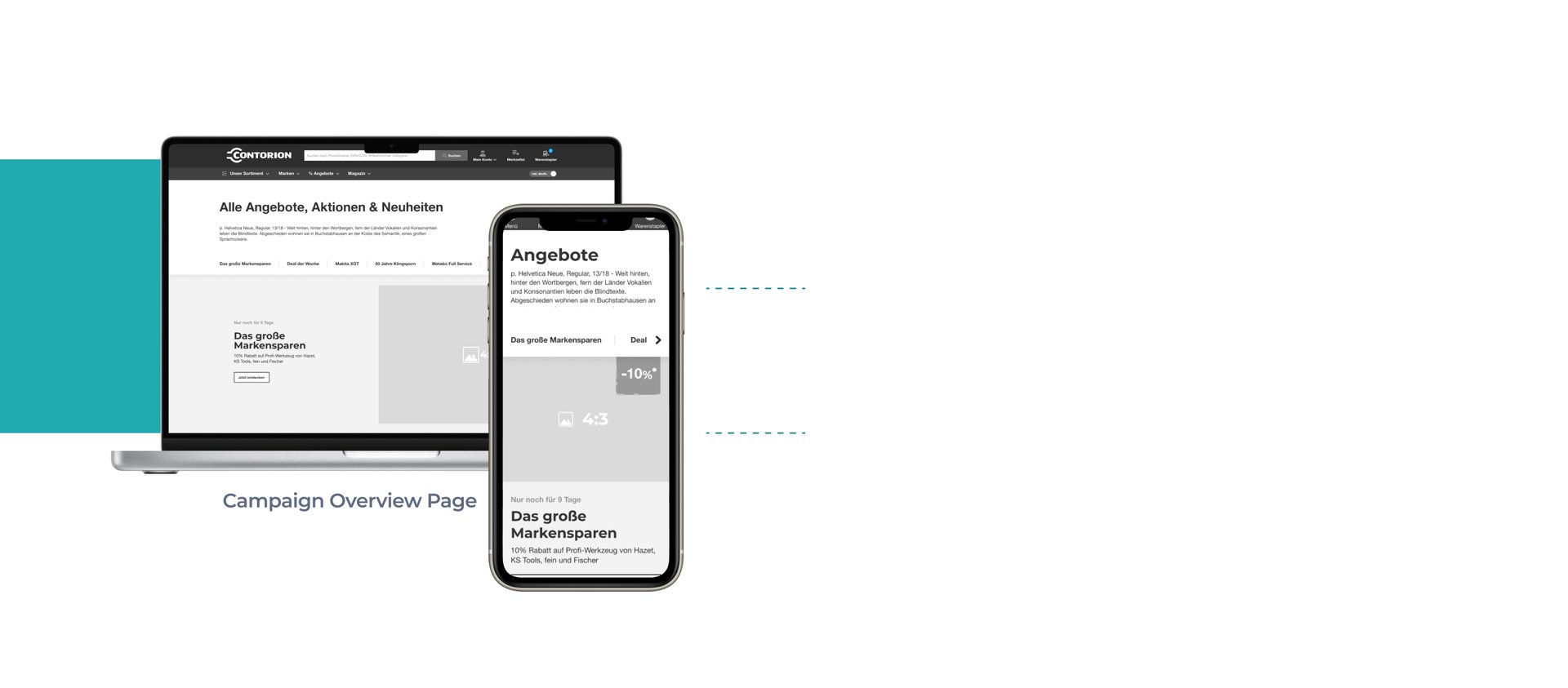
High-Fidelity Screens

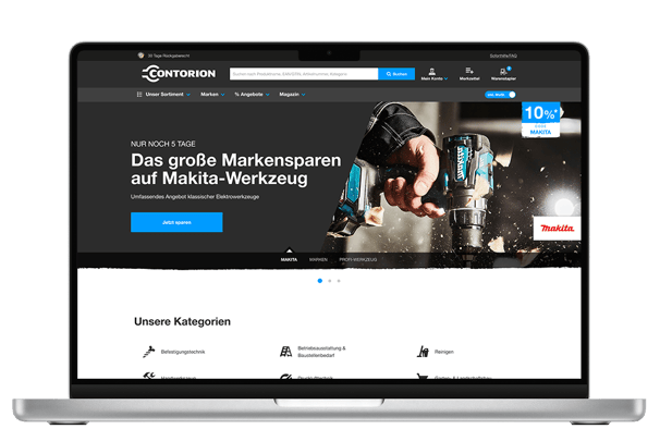
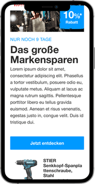
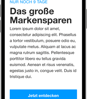
Homepage
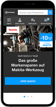
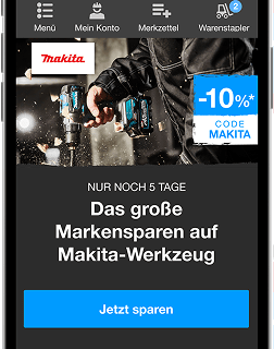

Homepage

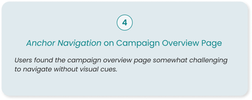
Campaign Overview Page
From Concept to Confidence

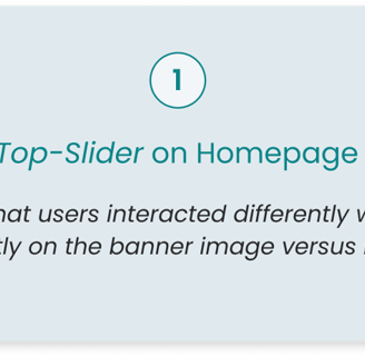
The interview focused on how users discover offers, including their expectations for the "Offer of the Week" and their general experience navigating the website. Tasks involved locating specific promotions, understanding the clarity of pages, and identifying expected vs. actual placements of campaigns.
For example, participants were asked, "How would you go about finding offers?" and "Did you find the promotion where you expected to find it?" Additionally, users evaluated the design and usability of the campaign overview, brand pages, and search results, including how easy it was to find deals, products, and category links.
User Interview
Key Insights

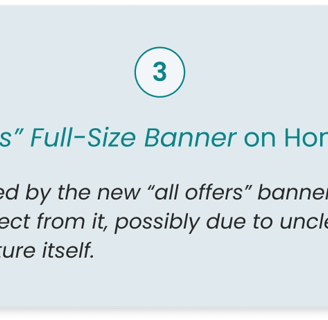
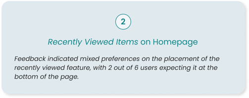
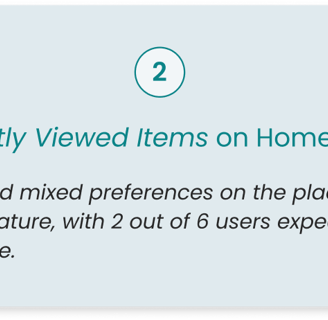
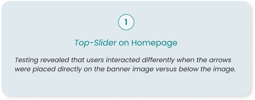
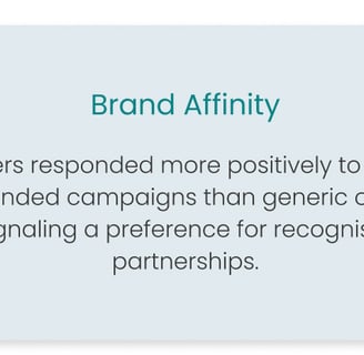
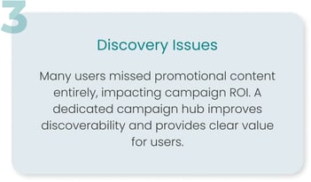
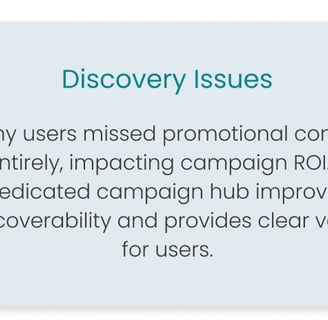
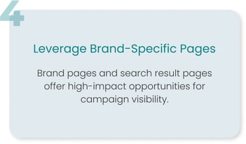
Note: Due to confidentiality, not all insights can be disclosed. These are a few selected insights derived from testing that guided our next steps and suggestions
Reflection

This project strengthened my ability to navigate complex stakeholder environments and drive UX impact within technical and organisational constraints. Balancing user needs with business goals, I refined my skills in strategic design, cross-functional collaboration, and data-driven decision-making.
Lessons Learned & Growth
Key Learnings
Campaign positioning drives engagement.
Testing confirmed that placement significantly influences interaction, underscoring the value of A/B testing banners, navigation, and search integrations.
Clear messaging enhances usability.
Users found campaign terminology inconsistent, highlighting that UI alone isn’t always enough—precise labels and distinct categories are crucial.
Personalisation improves discoverability.
Industry-specific recommendations and targeted promotions led to better user engagement.
Small design changes, big impact.
Optimising sliders, banners, and CTA placement measurably improved usability.
Collaboration is key.
Working closely with developers, PMs, and marketing teams sharpened my ability to align diverse priorities into a cohesive UX strategy.
Adaptability fuels progress.
Managing shifting priorities and constraints reinforced my agility in problem-solving.
While not all insights can be disclosed, this project deepened my ability to craft scalable, user-centred solutions within real-world limitations—enhancing both my strategic thinking and execution in e-commerce UX.

Looking ahead, there are several areas to build upon in order to refine and enhance the campaign system further:
Next Steps & Suggestions
A/B Testing Campaign Placement
Continue to test different placements for campaigns on the homepage, category pages, and within search results. We could also experiment with variations of the hero banner and carousel slider to further optimise engagement.Refine Campaign Terminology
Clear and consistent naming conventions are crucial. Conducting additional user research to define precise terms for different campaign types will help reduce confusion and improve the user experience.Personalisation and Dynamic Content
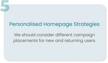
Expanding personalised content, like recommended products or industry-specific offers, would enhance discoverability. Further development in segmentation (new vs. returning users) could allow for a more tailored experience, boosting conversion.Enhance Mobile Experience
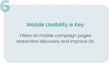
Focus on optimising campaign discoverability and navigation for mobile users. This includes refining the mobile layout, adding filters, and ensuring that elements like banners and CTAs are responsive and user-friendly.Supplier & Brand Customisation
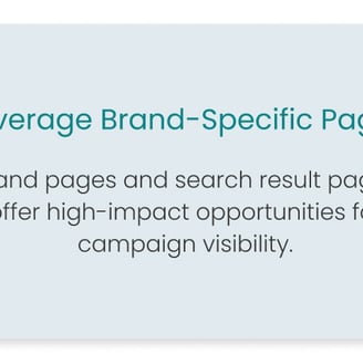
Provide more flexibility for suppliers in creating campaigns while ensuring tracking and reporting is consistent. This could include adding custom banners or creating industry-specific campaigns for targeted user engagement.Ongoing Performance Monitoring
Implement better tracking and reporting to gather insights on campaign performance and engagement. This will help us continuously iterate on designs based on real data.
By focusing on these next steps, we can further strengthen the effectiveness of the campaign system, optimising the user experience while also meeting business goals.