
Making Search Feel Effortless
Enhancing Mobile Filters to Make Product Search Smoother, Smarter, and More Inclusive.
UX & UI Case Study
Making Search Feel Effortless
Enhancing Mobile Filters to Make Product Search Smoother, Smarter, and More Inclusive.
UX & UI Case Study

PRODUCT OVERVIEW
Contorion GmbH, a Berlin-based e-commerce company specialising in tools and industrial supplies, faced usability challenges with its category filtering system. Inefficiencies in filtering led to user frustration and search abandonment.
As the lead UX/UI designer, I analysed usability issues, synthesised in-house research, ideated solutions, and validated improvements through testing. I collaborated with UX researchers, developers, and product managers to ensure an effective redesign.
RESPONSIBILITY
UX / UI Design
UX Research
TOOLS


PROBLEM STATEMENT
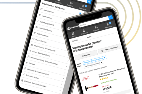
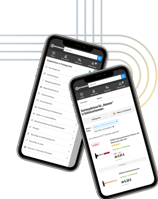
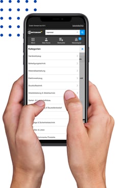
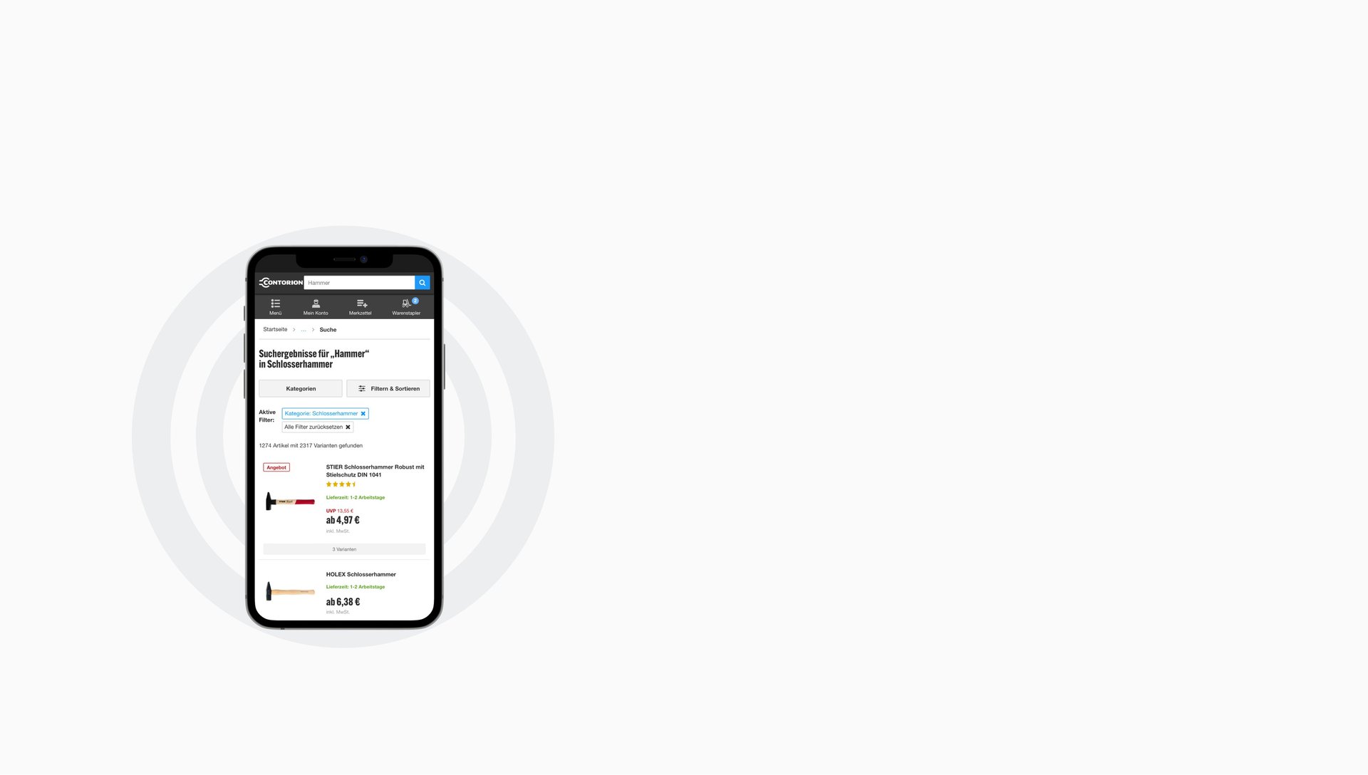
At Contorion GmbH, category filters on search results pages often posed significant usability challenges. The existing category filters were unclear, overwhelming, and non-responsive, leading to inefficient product discovery

GOALS
Enhance usability and engagement by creating a more intuitive filtering system through research-driven design methodologies.
Minimise drop-off rates and foster higher engagement with search result pages.
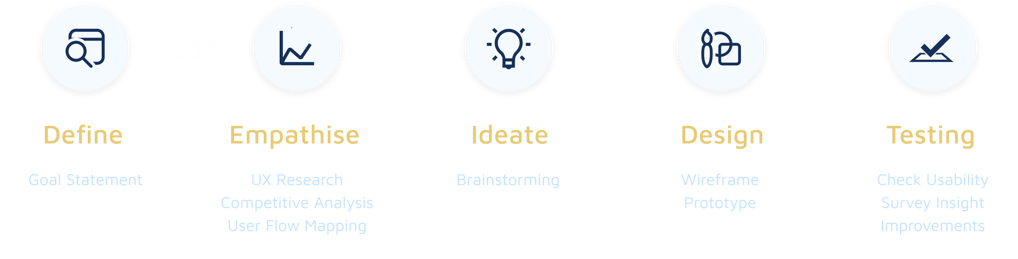
Design Process

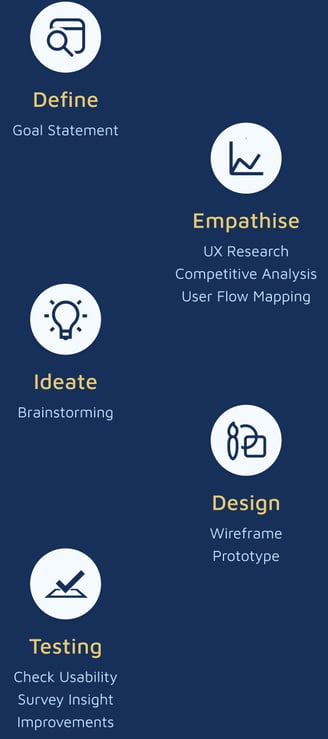
Design Process
DEFINE
To start off the project, I collaborated with key stakeholders, including product managers and development leads, to define the project's scope, resources, and objectives. This alignment was crucial in setting clear expectations and ensuring that the proposed solutions were feasible within existing technical and business constraints. We established measurable goals and documented them, accessible to all parties.
EMPATHISE
To start off the project, I collaborated with key stakeholders, including product managers and development leads, to define the project's scope, resources, and objectives. This alignment was crucial in setting clear expectations and ensuring that the proposed solutions were feasible within existing technical and business constraints. We established measurable goals and documented them, accessible to all parties.
UX Research
Competitive Analysis
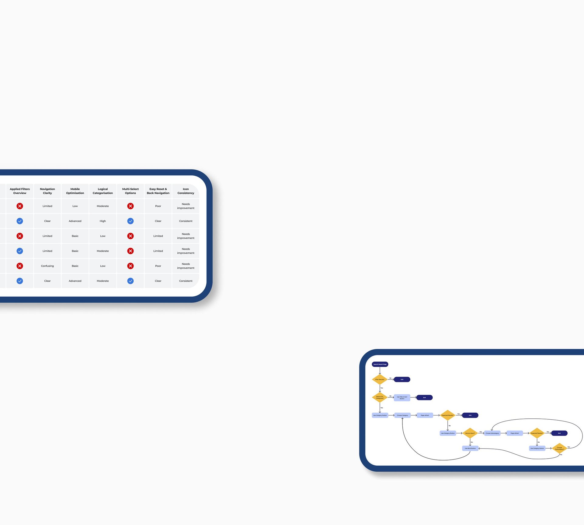
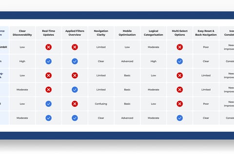
A competitive analysis was essential for this project to identify usability gaps and benchmark Contorion’s filtering experience against leading e-commerce platforms and competitors. Given the limitations of time and resources, leveraging insights from existing platforms provided valuable guidance. By analysing filtering behaviours across Contorion, Amazon, Werkzeugstore24, svh24, Festool, and Obi, I was able to pinpoint best practices, uncover friction points, and determine actionable improvements tailored to Contorion’s needs.
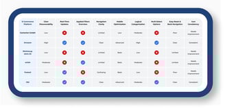
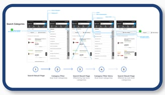
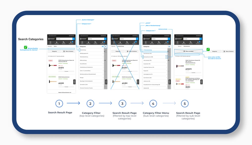
User Flow Mapping
Mapping the user flow revealed the complexity of this seemingly simple feature. While filtering should be effortless, Contorion's system required multiple steps and frequent page reloads, leading to long loading times and potential user frustration. Users unfamiliar with the category system often felt overwhelmed or lost. Identifying these pain points allowed for targeted optimisations to enhance usability and streamline the filtering process.
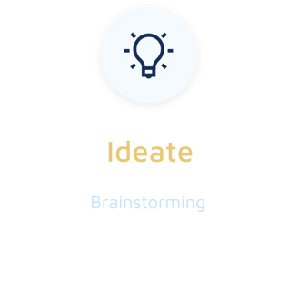
IDEATE
I initiated collaborative sessions with UX/UI designers using Miro to brainstorm potential improvements to the filtering system. Once initial concepts were outlined, I validated them with product managers to ensure alignment with business objectives. Throughout the process, I kept developers informed about potential technical implications and upcoming adjustments. Given time and resource constraints, I was unable to organise a full-team meeting but ensured that key stakeholders approved changes before proceeding to the next phase. Below is an extract from the Miroboard.
Brainstorming
DESIGN
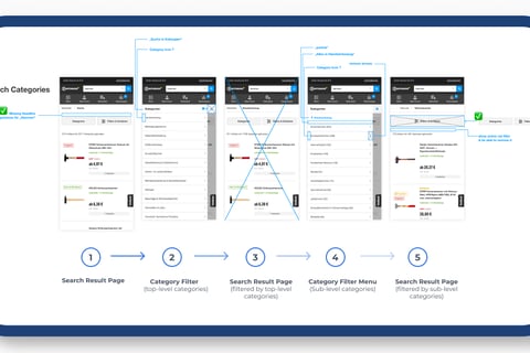
High Fidelity Wireframes
Using Figma, I created low-fidelity wireframes to explore design improvements while ensuring alignment with Contorion’s brand design and technical constraints.
Due to Contorion’s reliance on legacy code, significant structural changes were not feasible without a complete redesign. This limitation required careful adaptation within existing technical boundaries without necessitating an overhaul of the entire system.
Prototyping
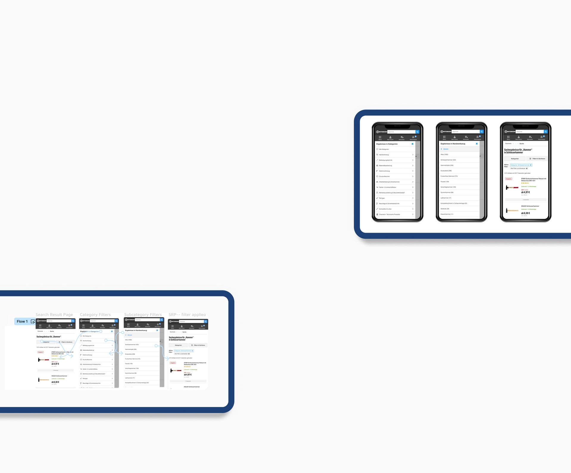
Created interactive prototypes using InVision, including both the redesigned version and the original filtering system, to validate design concepts and workflows. These prototypes were used in unmoderated usability testing, enabling participants to compare both versions and provide insights into usability improvements.
TESTING
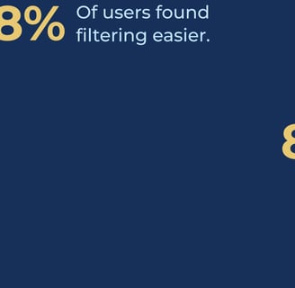
To validate the new design, I collaborated with a UX research colleague and conducted structured testing using Maze. Participants completed predefined tasks with both the old and new filtering systems, allowing for direct usability comparison. A short questionnaire provided additional qualitative insights. Recruitment via email outreach to Contorion customers who had opted into user tests resulted in 183 participants. Key findings confirmed significant usability improvements with the new design.
These results confirmed that the redesigned filtering experience significantly enhanced usability, aligning with both user expectations and business objectives.
The Setup
Key Findings

Impacts
The new filtering system significantly reduced frustration, as reflected in user feedback and usability test results.
Enhanced User Satisfaction
Higher Engagement & Retention
Improved filter clarity and ease of use led to a reduction in drop-off rates and increased product discovery.
Informed Future Enhancements
The insights gained laid the groundwork for further optimisations, particularly in mobile filtering behaviour.
Reflecting on this project, several key learnings emerged.
The complexity of even seemingly minor UX adjustments, such as category filtering, became evident when considering technical constraints and legacy systems. Striking a balance between ideal solutions and feasible implementations was crucial.
Cross-functional collaboration proved essential—aligning stakeholders early and maintaining continuous communication ensured that the project remained both user-centric and technically viable.
Usability testing reinforced the value of iterative design, as real user feedback highlighted unforeseen pain points and opportunities for refinement.
Key Takeaways
While the implemented improvements significantly enhanced the filtering experience, further refinements were identified during research and testing but could not be executed due to technical constraints and resource limitations:
Real-Time Filtering Updates: The current legacy system requires full-page reloads for every filter change. A more seamless, AJAX-based update system would enhance speed and usability.
Advanced Filtering Logic: Introducing multi-select options and dynamic filtering adjustments based on user selections would provide greater flexibility.
Mobile-Specific Enhancements: Deeper research is required to optimise filter behaviour on mobile devices, ensuring a more intuitive and efficient interaction.
Personalised Filtering Options: Implementing AI-driven recommendations or saved filter preferences would enhance long-term usability and engagement.
A/B Testing for Further Validation: While the usability study yielded strong insights, future A/B testing with a larger sample size could provide additional data on long-term engagement and conversion impact.
These insights highlight future opportunities to refine and expand upon the existing improvements while ensuring scalability and long-term user satisfaction.
Next Steps
Design Showcase
Explore innovative product designs by a talented product designer.


